The question we were trying to answer
Every telecom company loses customers — but can you predict who is about to leave before they actually do? That's the churn prediction problem. If you can spot a customer who's about to cancel, you have a window to intervene — offer a discount, improve their plan, or just check in. Miss that window and they're gone.
We took 7,043 real customer records from IBM's Watson Analytics dataset and built two neural network models to answer exactly that question.
The customers most likely to leave are the ones who've been around the least and are paying the most. New + expensive = high risk. Get a customer past the 30-month mark and they're almost certainly staying.
Step 1 — Looking at the raw data
The dataset has 21 columns — customer ID, demographics, services (phone, internet, streaming, security), contract type, payment method, charges, and whether they churned. Here's what the first few rows look like straight out of the CSV:
One early catch: TotalCharges was stored as text, including blank values for brand new customers who'd never been billed. We converted it to numeric and filled blanks with the median — simpler and cleaner than dropping those customers.
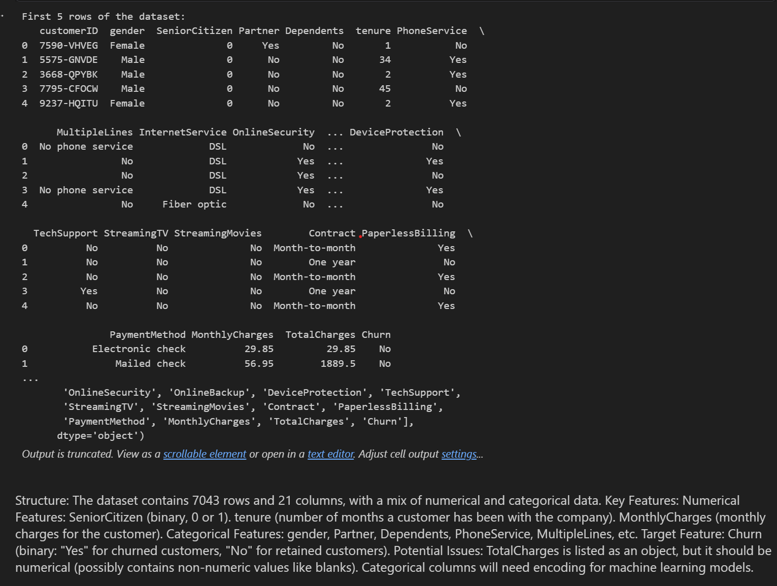
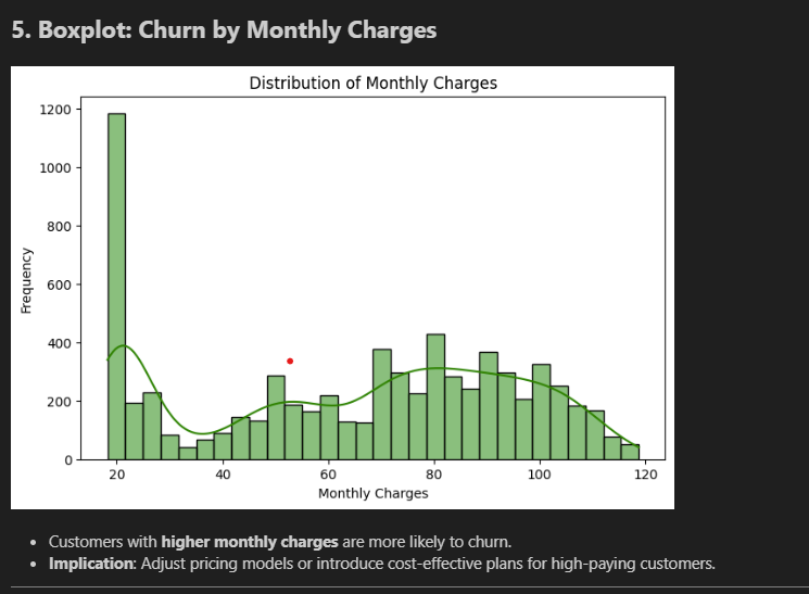
Step 2 — First look at the distributions
Before touching any model, we visualised how the data is shaped. These are the initial charts straight from the notebook:
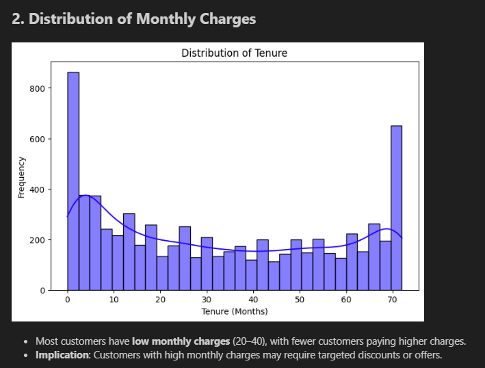
Tenure chart (top): Giant spike at month 0–2 (new customers), relatively flat through the middle, then another spike at month 70–72 (long-term loyalists). The customer base is polarised — you either just joined or you've been here forever. Very few people in between.
Monthly Charges chart (bottom): Massive spike at $20 (basic phone-only plans), dips in the middle, then climbs again at $70–$100 (premium packages with internet, streaming, security). Two very different customer profiles.
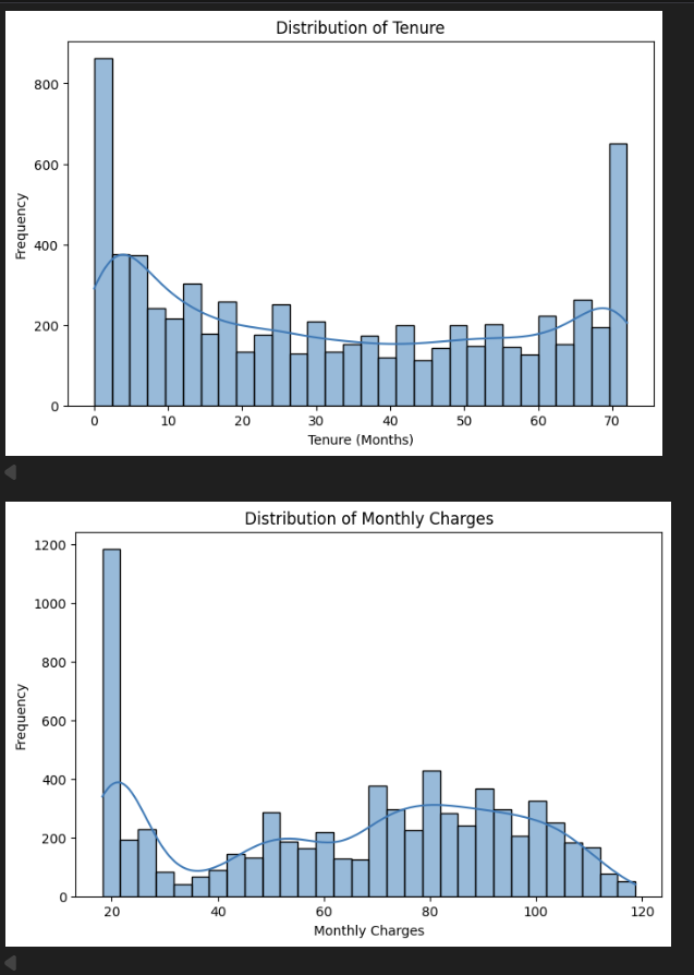
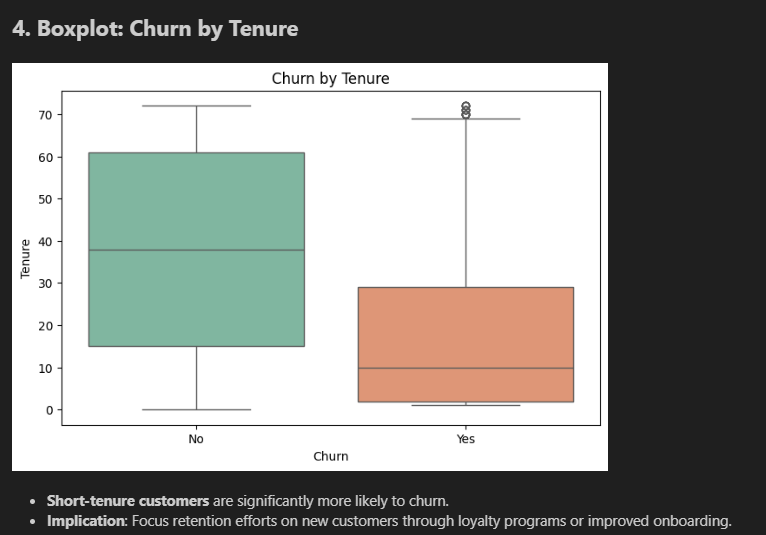
Step 3 — Does churn relate to tenure and charges?
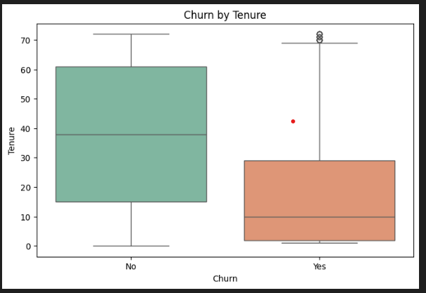
These boxplots compare customers who stayed vs customers who left — first pass:
Tenure boxplot (top): The "No" (stayed) box spans 15–60 months, median around 38. The "Yes" (churned) box is tiny and sits right at the bottom — median around 10 months. Most churners are gone before month 30. This is the clearest signal in the dataset.
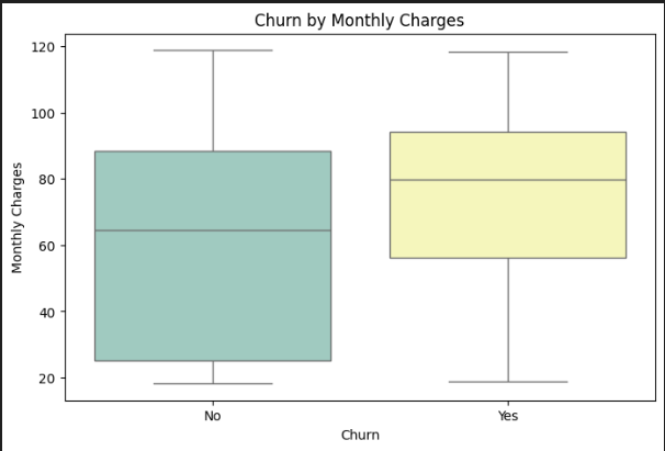
Monthly Charges boxplot (bottom): The "Yes" box sits higher. Churners' median is around $79/month; non-churners' median is around $65. A consistent $14/month gap — not a fluke.
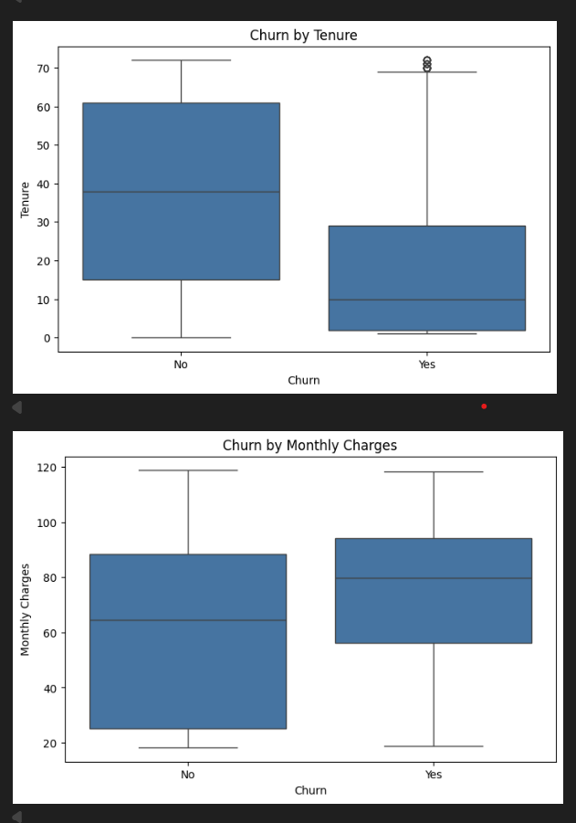
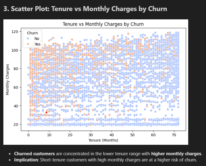
Step 4 — The same charts with colour, plus the key scatter plot
The scatter plot (bottom) is the most revealing chart in the project. Each dot is one customer. Look at the top-left corner — high charges, short tenure. That's where orange dots cluster. Bottom-right — low charges, long tenure — almost entirely blue. If you wanted a simple rule: "flag anyone paying over $70 who's been here under 12 months" — you'd catch a huge chunk of the real risk.
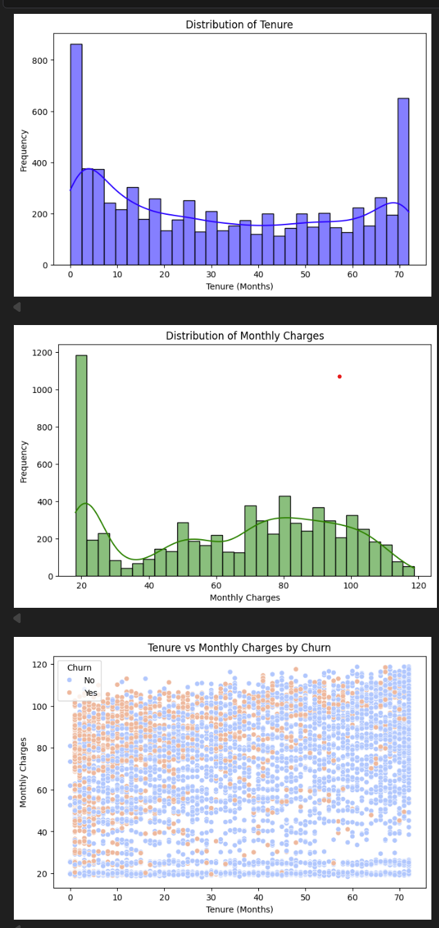
Step 5 — The notebook's annotated final charts
These are the charts as they appeared in the final submitted notebook, with findings written alongside each one:
Making the data model-ready
- New feature — AvgMonthlyCharges: TotalCharges ÷ tenure. Gives context — paying $80/month for 2 months is very different from paying $80/month for 5 years.
- One-hot encoding: Text columns like Contract type split into separate yes/no columns. Models can only process numbers.
- StandardScaler: Normalised all numerical columns so no single feature dominates just because it has larger numbers.
- Result: 31 clean numeric features, split 80/20 into 5,634 training and 1,409 test samples.
data_encoded['AvgMonthlyCharges'] = data_encoded['TotalCharges'] / data_encoded['tenure']
data_encoded['AvgMonthlyCharges'].replace([np.inf, np.nan], 0, inplace=True)

scaler = StandardScaler()
data_encoded[numerical_features] = scaler.fit_transform(data_encoded[numerical_features])
Model 1 — Neural Network
A feedforward neural network: layers that transform the data, learning which combinations of features best predict churn over 50 training passes. The Dropout layers (30%) randomly silence neurons during training — forcing the model to learn robust patterns instead of just memorising the training data.
nn_model = Sequential([
    Dense(64, activation='relu', input_shape=(X_train.shape[1],)),
    Dropout(0.3),
    Dense(32, activation='relu'),
    Dropout(0.3),
    Dense(1, activation='sigmoid')  # outputs a 0–1 churn probability
])
Model 2 — CNN on tabular data
CNNs are usually for images — but we reshaped each customer's 31 features into a column (31×1) and let a convolutional filter scan across adjacent features looking for clusters that signal churn. It sounds unusual, but it works: the filter can detect combinations like "fibre optic + month-to-month contract + high charges" as a unit.
X_train_cnn = np.expand_dims(X_train, axis=-1).astype('float32')

cnn_model = Sequential([
    Conv1D(32, kernel_size=3, activation='relu',
           input_shape=(X_train_cnn.shape[1], 1)),
    Dropout(0.3),
    Flatten(),
    Dense(64, activation='relu'),
    Dropout(0.3),
    Dense(1, activation='sigmoid')
])
Results — full breakdown
Accuracy 79.49% — about 1,120 of 1,409 test customers predicted correctly.
Precision 63.75% (churn) — when the CNN says "this person will churn," it's right 64% of the time. 36% are false alarms.
Recall 52.67% (churn) — the model caught 53% of actual churners. Half slipped through — room to improve.
AUC 70.9% — measures how well the model separates churners from non-churners. Random guessing = 50%. We're at 71% — a solid baseline.
The model is much better at predicting who stays (89% recall) than who leaves (53% recall) — because only 26% of the dataset churned. The classic imbalanced dataset problem.
What I'd do differently
- SMOTE oversampling — generate synthetic churn examples so the model stops favouring the majority class
- Lower decision threshold — use 0.35 instead of 0.5 to flag more churners. A false alarm is cheap; a missed churner is expensive.
- Try XGBoost — gradient boosted trees generally outperform neural networks on structured tabular data
- Richer features — support call history, plan change frequency, and payment delays would all be powerful additional signals